Board Meeting Materials
My goal was to ensure the content communicates clearly, reinforces our strategic message, and feels unified across both print and mobile formats. The design is meant to elevate the strategic content, not compete with it. It creates a consistent and credible framework that helps our story land with clarity and impact.
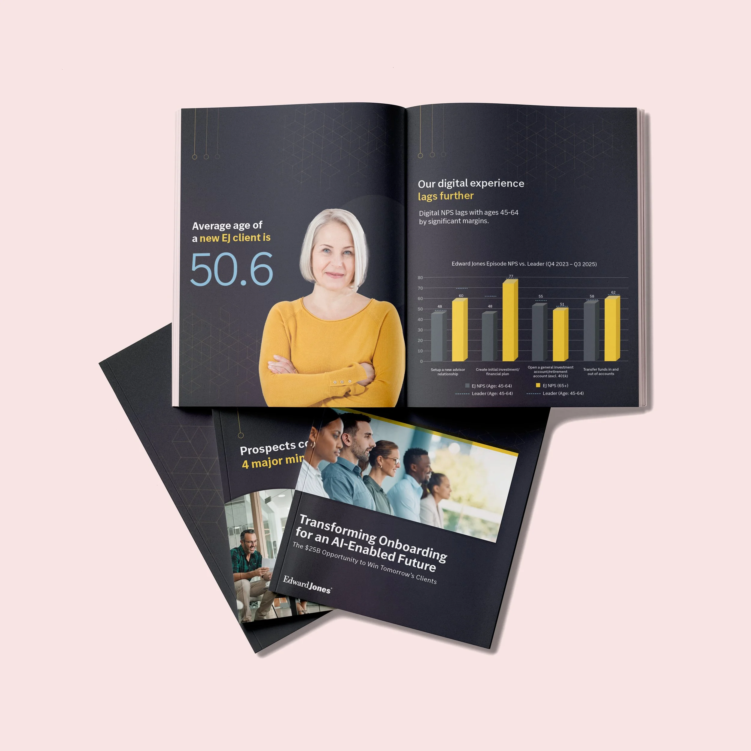
The darker backgrounds create a sense of seriousness and focus, while the clean typography makes it easy to scan and absorb. For a board-level audience, we prioritized clarity and professionalism over decoration. Every element earns its place.
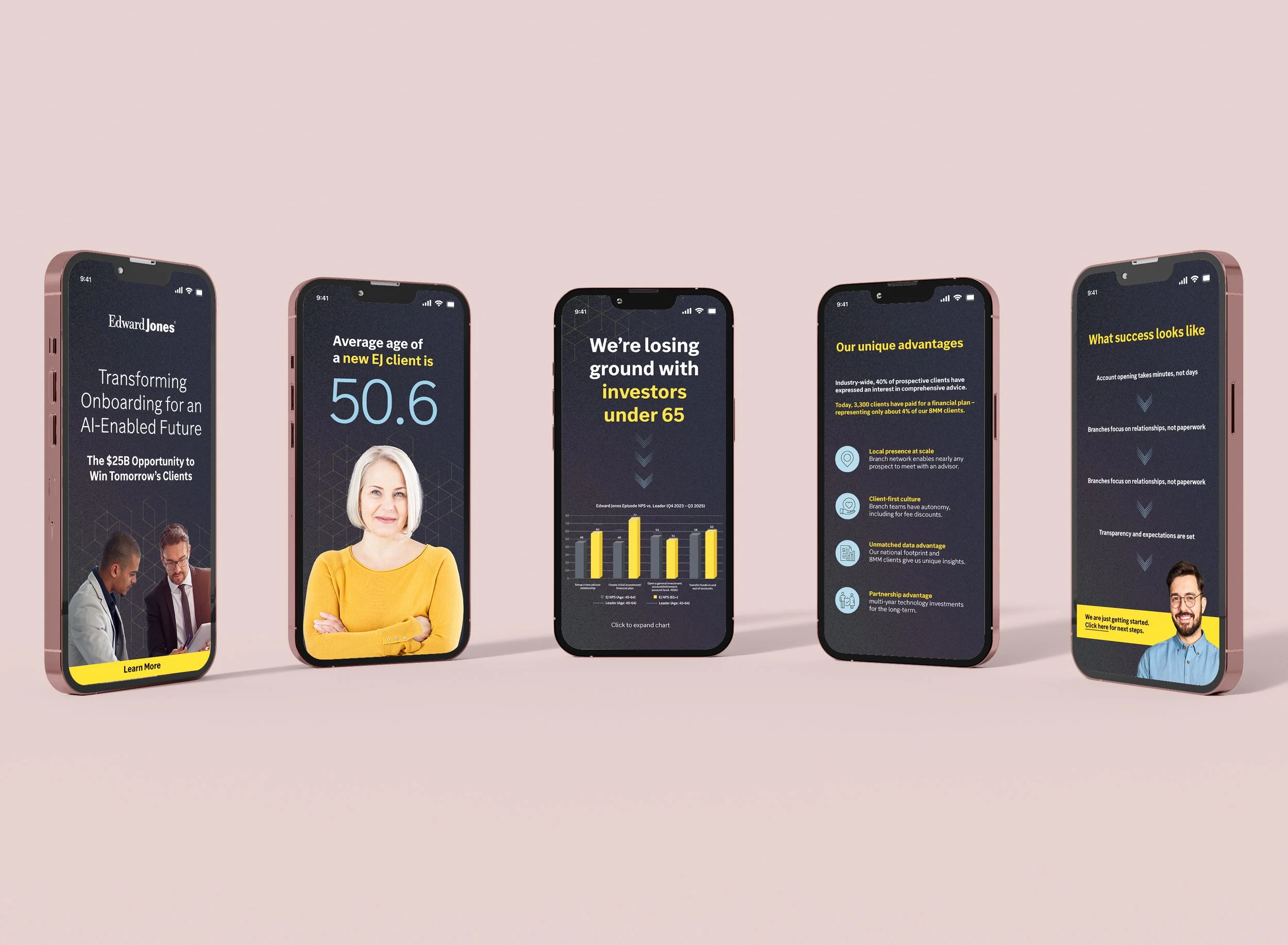
We built this in two formats—mobile and print—because each serves a different strategic purpose. The mobile screens function as a prototype experience. They allow the audience to follow along at their own pace, interact with the story, and engage with the content more personally.
The print booklet, on the other hand, is designed as a leave‑behind for board members. It provides a deeper, more permanent reference that can be reviewed after the session